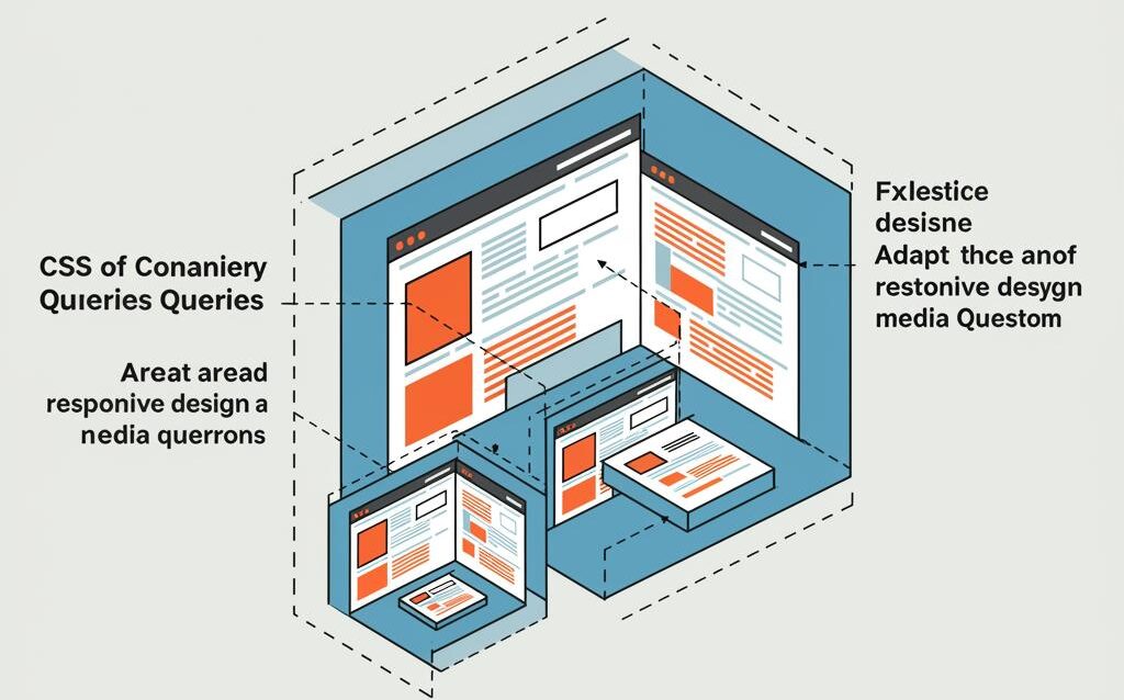
CSS Container Queries: Next-Level Responsive Design
CSS Container Queries: Responsive Design Beyond Media Queries
For years, media queries have been the cornerstone of responsive web design. They allow us to adapt our website’s layout and styling based on the viewport size. However, media queries have limitations. They only consider the viewport, not the size of the parent container in which an element resides. This is where CSS container queries come in, offering a more granular and powerful approach to responsive design.
What are CSS Container Queries?
Container queries allow you to apply styles to an element based on the size of its containing element, rather than the viewport. This means you can create components that adapt their appearance based on their context, regardless of the screen size. Imagine a card component that displays differently when placed in a narrow sidebar versus a wide main content area. This is the power of container queries.
Understanding the Fundamentals
Container Names and Query Syntax
To use container queries, you first need to define a container name on the element you want to use as the container. This is done using the container-type and/or container-name properties. container-type defines the type of containment. container-name gives the container a specific name for easier targeting.
Here’s a breakdown of the properties:
- container-type: Specifies the type of containment. Possible values include:
- size: Creates a size container, querying based on the inline and block size.
- inline-size: Creates an inline-size container, querying based on the inline size (width in horizontal writing modes).
- normal: The element is not a query container.
- container-name: Assigns a name to the container, allowing you to target it specifically with the
@containerat-rule. You can specify multiple names, separated by spaces.
The @container at-rule is used to define the styles that should be applied when the container meets certain conditions. The syntax is similar to media queries, but instead of viewport dimensions, you’re checking the container’s dimensions.
Example:
.card-container {
  container-type: inline-size;
  container-name: card;
}

@container card (min-width: 300px) {
  .card {
    /* Styles to apply when the container is at least 300px wide */
    flex-direction: row;
  }
}

@container card (max-width: 299px) {
  .card {
    /* Styles to apply when the container is less than 300px wide */
    flex-direction: column;
  }
}
Applying Styles Based on Container Size
Within the @container at-rule, you can apply any CSS properties you would normally use. This allows you to completely customize the appearance of elements based on the container’s size. Consider these examples:
- Changing the layout from a single column to a two-column grid.
- Adjusting font sizes for better readability.
- Showing or hiding elements based on available space.
- Changing the image orientation.
Practical Use Cases
Card Components in Different Layouts
One of the most common use cases for container queries is adapting card components to different layout contexts. As mentioned earlier, a card in a sidebar might need a different layout than a card in the main content area. Container queries make this easy to achieve.
Imagine a news article card. In a narrow sidebar, you might want to display only the title and a small image. In the main content area, you could show the full article summary and a larger image.
Navigation Menus
Container queries can also be used to create more flexible navigation menus. A navigation menu inside a header might need to collapse into a hamburger menu on smaller screens, but if the header itself is very wide, the menu could remain expanded even on a smaller viewport.
Responsive Images within Components
While <picture> and srcset attributes are great for viewport-based responsive images, container queries allow you to tailor images to the dimensions of their container. This is especially useful when you have images within reusable components that might be placed in various contexts.
Benefits of Using Container Queries
Improved Code Reusability
Container queries promote code reusability by allowing you to create components that adapt to their context without requiring specific media queries for each instance. This leads to cleaner, more maintainable code.
More Granular Control
Container queries provide more granular control over the appearance of elements compared to media queries. You can target specific containers and apply styles based on their size, regardless of the viewport.
Enhanced User Experience
By adapting content to the available space within a container, you can provide a better user experience. Elements will always be appropriately sized and formatted, regardless of the screen size or layout context.
Challenges and Considerations
Browser Support
While browser support for container queries has improved significantly, it’s still important to check compatibility before implementing them in production. Use tools like “Can I Use” to verify support across different browsers and versions.
Performance
While generally performant, excessive use of container queries, especially with complex calculations, could potentially impact performance. Profile your code and optimize where necessary.
Debugging
Debugging container queries can be a bit more challenging than debugging media queries. Browser developer tools are constantly improving, but it’s helpful to understand how to inspect the container’s dimensions and the applied styles.
Conclusion
CSS container queries represent a significant advancement in responsive web design. They offer a more flexible and powerful approach to creating adaptable components that respond to their context. While there are some challenges to consider, the benefits of improved code reusability, granular control, and enhanced user experience make container queries a valuable tool for any web developer. As browser support continues to grow, expect to see container queries become an increasingly important part of modern web development workflows.

